Bold. Playful. Retrofuturist.
When Lucy brought me in to work on Practical, an AI training brand for event and experiential agencies, I was beyond chuffed. This one had my name all over it.
Here’s why:
- The Experience: She was building new training, and I brought two things to the table. Three years leading global partner onboarding for a SaaS firm, and a lifelong obsession with design. This project needed both.
- The Vision: She knew exactly what she wanted. The brief was detailed, but she stayed open to ideas. Refreshing!
- The Vibe: A brand for creatives. Bright, bold, playful, still professional, with a hint of dry British wit.
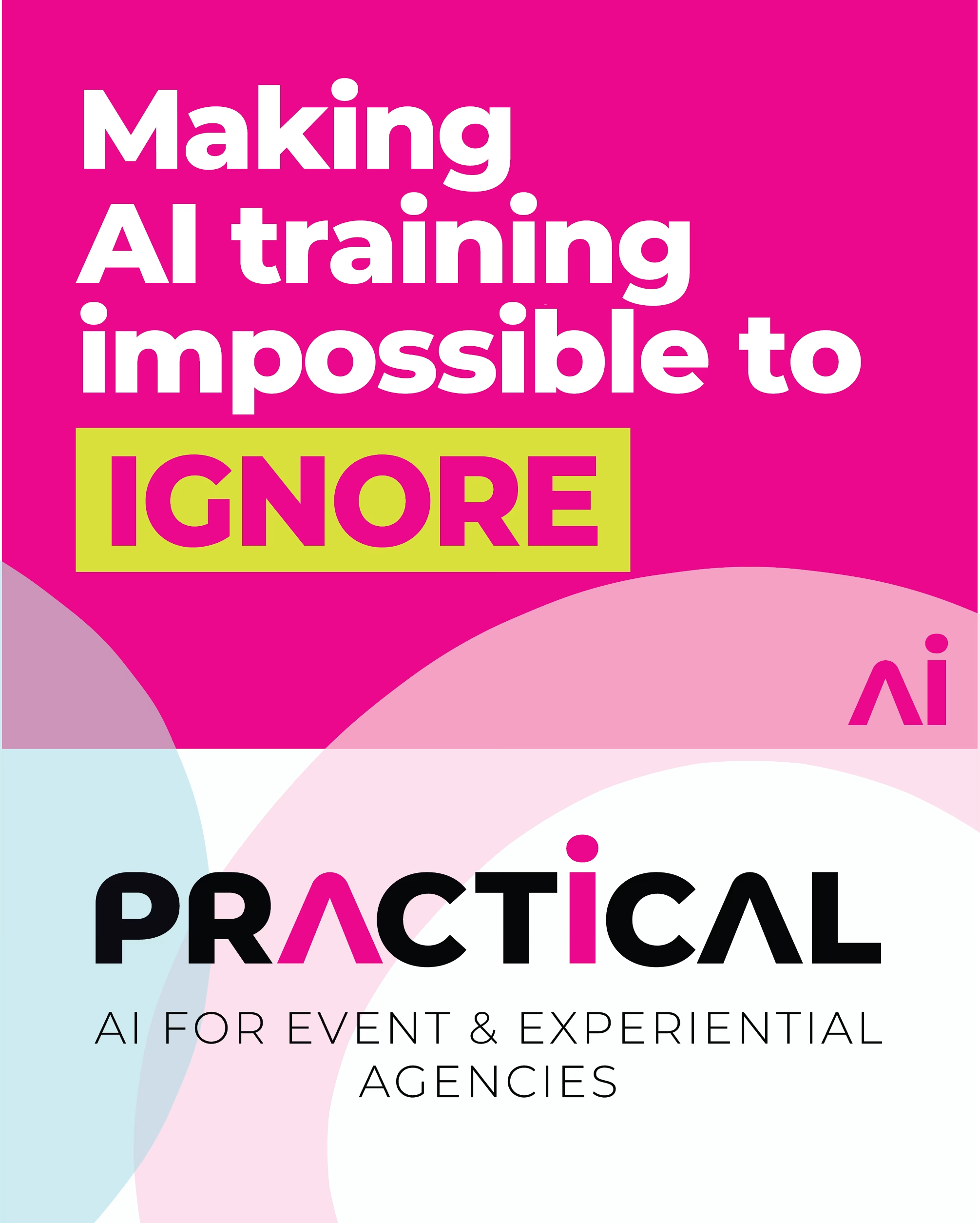
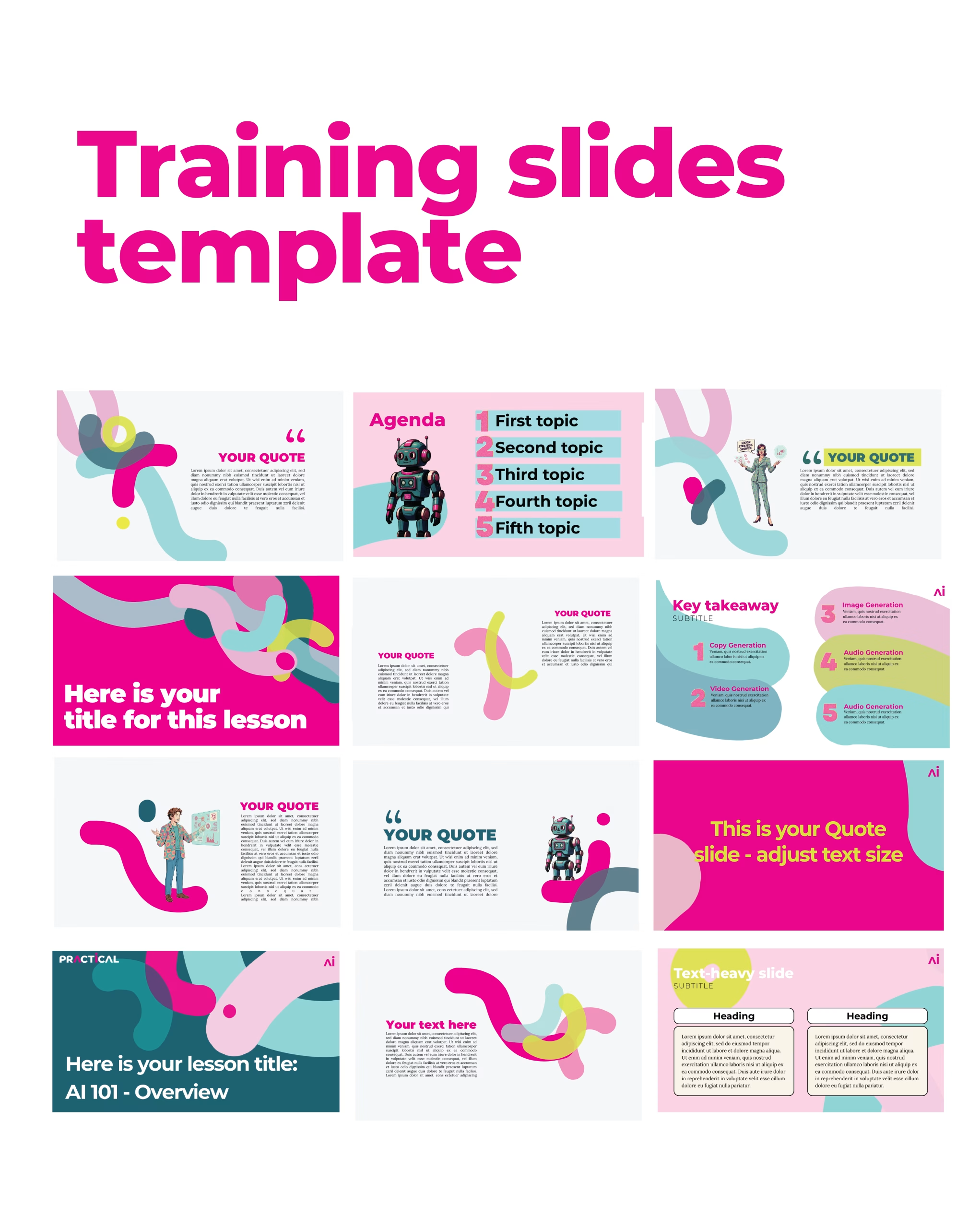
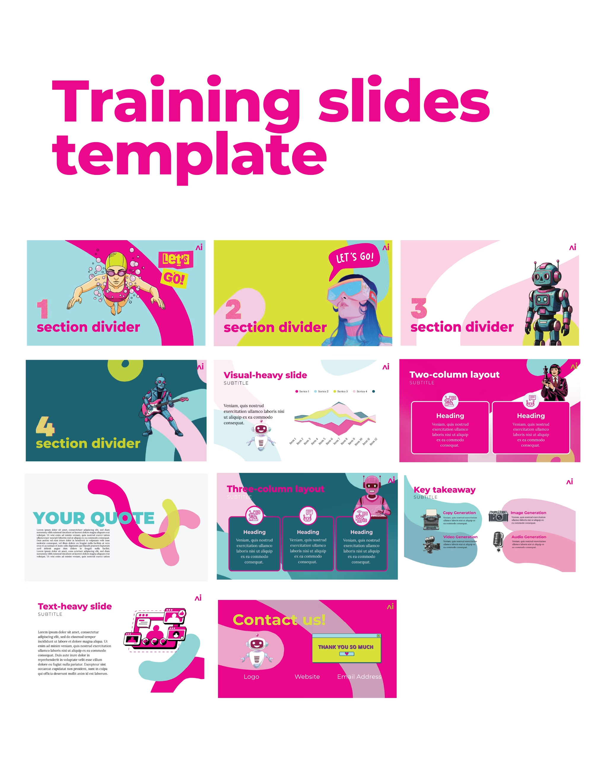
It had to feel like a curious collaborator. Approachable, high energy, and unapologetically vibrant. Pink, teal, neon. Built to stand out, and actually keep learners engaged.
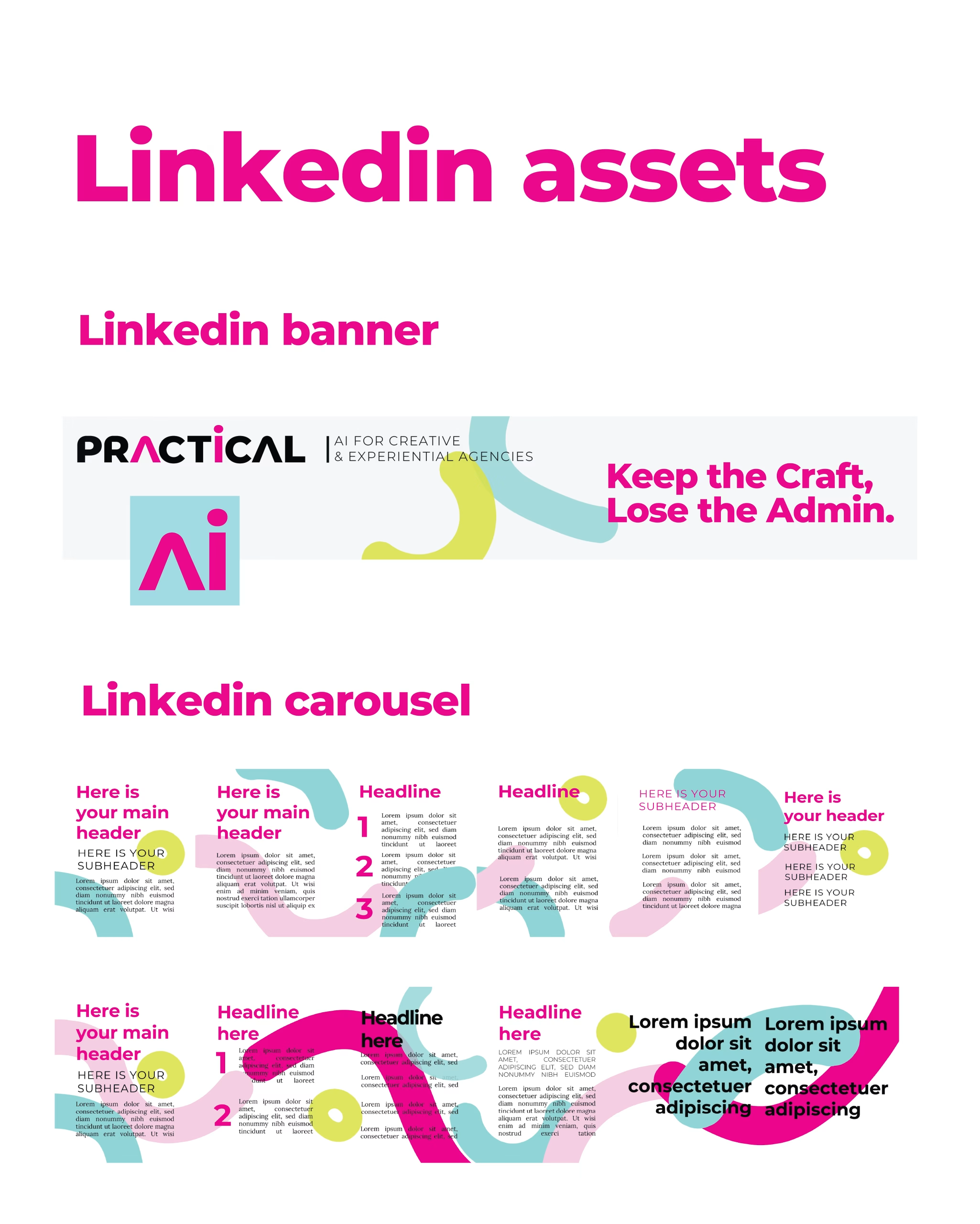
The moment Lucy said retrofuturism, I ran with it. And the pressure was real. When your audience is a room full of creatives, safe just doesn’t cut it. We needed something that could break through the LinkedIn sea of blue and actually feel alive.
Here’s the constraint. She had Canva and a bootstrapped budget. No illustration commissions. No agency retainer. So I built the brand architecture in Illustrator (the shapes, the system, the bones) then translated everything into Canva so Lucy could stay completely autonomous. No dependency. No coming back to me every time she needs a new asset.
After deep research and a genuinely collaborative process, here’s where we landed.
Proper creative spark.
Leave a Reply